
리액트로 프로젝트를 생성하여 개발하는 과정 중 리액트의 필수 문법 및 기초적인 부분, 심화 과정 등을 정리한 문서입니다. 정리한 부분에는 제가 이해하는 관점에서만 정리를 하였기 때문에 초점은 보여주는 형식이 아닌 제가 필요할 때 사용하려는 목적이 담겨져 있습니다.
이번에는 styled-components 를 배워보도록 하겠습니다. 이번에 배워볼 기술은 CSS in JS 라는 기술입니다. 이 문구가 뜻하는 그대로, 이 기술은 JS 안에 CSS 를 작성하는 것을 의미하는 것으로써 template Literal 구문을 사용하여 만들어집니다. 그러면 styled-components 를 먼저 설치하는 과정과 예제들을 차근 차근 배워가면서 스타일을 어떻게 정의하고 사용하는지 파악하도록 하겠습니다.
그러면 styled-components 에 대해 배워보도록 합시다.
# Contents
- styled-components 설치
- styled-components 예제
# styled-components 설치
새로운 프로젝트를 생성하고 라이브러리를 설치하겠습니다.
아래 명령어를 통해 프로젝트와 라이브러리를 설치합니다.
npx create-creat-app styled-components-test
cd styled-components-test
npm install --save styled-components
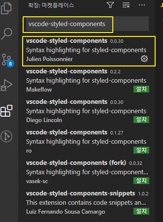
참고로 styled-components 를 사용할 때 아까 말씀드렸던 템플릿 리터럴로 표기가 됩니다. 따라서 css 문법이 보이지 않기 때문에 코드 생성과 작성에 아주 힘들다고 판단됩니다. visual studio 에서는 이러한 기능을 보완하고자 하는 플러그인이 존재합니다. 해당 플러그인을 설치하면 오류와 버그가 발견하기 쉽고, 코드의 생산성이 증가하면서 빠르게 코딩할 수 있다는 장점이 있습니다. visual code를 통해 해당 라이브러리를 다운받아주세요.
플러그인명은 vscode-styled-components 입니다. 아래와 같이 다운받아 주시기 바랍니다.
그러면 본격적으로 코드 작성을 시작해보도록 하겠습니다.
# styled-components 예제
첫번째 컴포넌트는 원을 생성하도록 하겠습니다. 원을 생성하기 위해서는 div 내부의 css를 조절해야 하는데요. styled-component를 통해 스크립트 내에서 css를 선언하여 조작해보도록 하겠습니다. 컴포넌트 내에 css를 조작하기 위해서는 설치했던 styled-component 를 임포트 해줘야 합니다.
아래 코드를 통해 styled-components 를 확인해보세요
import styled from "styled-components";

function App() {
    const Circle = styled.div`
        width: 150px;
        height: 150px;
        border-radius: 50%;
        background-color: blue;
    `;
    return (
        <div className="App">
            <Circle />
        </div>
    );
}

export default App;
이렇듯 div를 꾸미고 싶으면 선언한 변수.div 를 적으시고 그 뒤에 템플릿 리터럴로 css를 정의하면 되겠습니다.
예를 들어 input 태그의 css를 변경하고 싶다면 style.input`` 을 이용하면 되겠습니다.
그러면 props를 주는 것은 어떻게 할까요??
아래 코드를 통해 props를 확인해보세요.
import styled, { css } from "styled-components";

function App() {
    const Circle = styled.div`
        width: 150px;
        height: 150px;
        border-radius: 50%;
        background-color: ${(props) => {
            return props.color || "black";
        }};
        ${(props) => {
            return (
                props.huge &&
                css`
                    width: 200px;
                    height: 200px;
                `
            );
        }}
    `;
    return (
        <div className="App">
            <Circle color="red" huge />
        </div>
    );
}

export default App;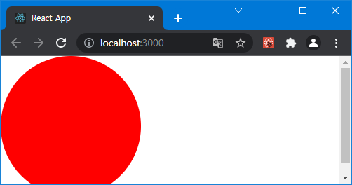
이제 버튼을 생성해보도록 하겠습니다.
1. 버튼 생성
기본적인것부터 단계적으로 구현해봅시다.
src 안에 components 디렉터리를 생성 후, 그 안에 Button.js 파일을 생성하세요.
아래 코드를 통해 Button.js를 완성하세요.
import react from "react";
import styled from "styled-components";

const StyledButton = styled.button`
    display: flex;
    text-align: center;
    justify-content: center;
    border-radius: 4px;
    color: white;
    font-weight: 600;
    cursor: pointer;
    padding: 5px 0;
    height: 35px;
    width: 100px;
    border: 1px solid black;
    align-items: center;

    background: #228be6;

    &:hover {
        background: #339af0;
    }
    &:active {
        background: #1c7ed6;
    }
`;

function Button({ children, rest }) {
    return <StyledButton {...rest}>{children}</StyledButton>;
}

export default Button;
그다음에는 App.js에서 만든 버튼을 호출하여 주겠습니다.
아래 코드를 통해 App.js를 완성하세요.
import styled, { css } from "styled-components";
import Button from "./components/Button";

const AppBlock = styled.div`
    width: 512px;
    margin: 0 auto;
    margin-top: 4rem;
    border: 1px solid black;
    padding: 1rem;
`;

function App() {
    return (
        <div className="App">
            <AppBlock>
                <Button>BUTTON</Button>
            </AppBlock>
        </div>
    );
}

export default App;
2. ThemeProvider - Color 구현
ThemeProvider를 통하여 props.theme 에 변수에다가 값을 지정할 수 있습니다. ThemeProvider 에서는 보통 Color 색상 및 사이즈 등의 상수값을 전송하여 커스터마이징을 할 수 있습니다. 아래 예제를 통해 버튼의 색상을 ThemeProvider를 사용하여 변경하는 방법을 설명하도록 하겠습니다.
아래 코드를 통해 App.js를 완성하세요.
import styled, { css, ThemeProvider } from "styled-components";
import Button from "./components/Button";

const AppBlock = styled.div`
    width: 512px;
    margin: 0 auto;
    margin-top: 4rem;
    border: 1px solid black;
    padding: 1rem;
    display: flex;
`;

function App() {
    return (
        <div className="App">
            <ThemeProvider
                theme={{
                    palette: {
                        blue: "#228be6",
                        gray: "#495057",
                        pink: "#f06595",
                    },
                }}
            >
                <AppBlock>
                    <Button>BUTTON</Button>
                    <Button color="gray">BUTTON</Button>
                    <Button color="pink">BUTTON</Button>
                </AppBlock>
            </ThemeProvider>
        </div>
    );
}

export default App;
Button 태그 안에 color 라는 props를 제공하고, 그 안에 ThemeProvider 태그로 묶었습니다. 그러면 Button 컴포넌트 안에서는 props.theme 를 사용하여 해당 plette 변수를 이용할 수 있고, props로 받은 데이터도 가공하여 아래처럼 사용할 수 있습니다.
아래 코드를 통해 Button.js를 완성하세요.
import react from "react";
import styled, { css } from "styled-components";

/* 색상 */
const colorPicker = css`
    ${(props) => {
        const theme = props.theme;
        const color = props.color;
        const myColor = theme.palette[color];
        return css`
            background-color: ${myColor};
        `;
    }}
`;

const StyledButton = styled.button`
    display: flex;
    text-align: center;
    justify-content: center;
    border-radius: 4px;
    color: white;
    font-weight: 600;
    cursor: pointer;
    padding: 5px 0;
    height: 35px;
    width: 100px;
    border: 1px solid black;
    align-items: center;
    margin-left: 10px;
    background: #228be6;

    ${colorPicker}

    &:hover {
        background: #339af0;
    }
    &:active {
        background: #1c7ed6;
    }
`;

function Button({ children, ...rest }) {
    return <StyledButton {...rest}>{children}</StyledButton>;
}

Button.defaultProps = {
    color: "blue",
};

export default Button;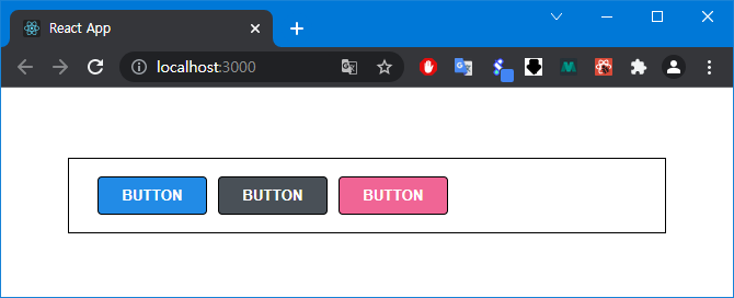
3. Props - Size 구현
ThemeProvider를 통하여 props.theme 에 변수에다가 값을 지정할 수 있었습니다. 기존 예제와 같지만 한번 더 복습하자는 의미를 하여 props에 size를 구현해보는 시간을 갖겠습니다.
아래 코드를 통해 App.js를 완성하세요.
import styled, { css, ThemeProvider } from "styled-components";
import Button from "./components/Button";

const AppBlock = styled.div`
    width: fit-content;
    margin: 0 auto;
    margin-top: 4rem;
    border: 1px solid black;
    padding: 1rem;
    display: flex;
`;

const ButtonGroup = styled.div`
    display: flex;
    flex-direction: column;
    justify-content: center;
    align-items: center;
`;

function App() {
    return (
        <div className="App">
            <ThemeProvider
                theme={{
                    palette: {
                        blue: "#228be6",
                        gray: "#495057",
                        pink: "#f06595",
                    },
                }}
            >
                <AppBlock>
                    <ButtonGroup>
                        <Button size="small">BUTTON</Button>
                        <Button>BUTTON</Button>
                        <Button size="large">BUTTON</Button>
                    </ButtonGroup>

                    <ButtonGroup>
                        <Button size="small" color="gray">
                            BUTTON
                        </Button>
                        <Button color="gray">BUTTON</Button>
                        <Button size="large" color="gray">
                            BUTTON
                        </Button>
                    </ButtonGroup>

                    <ButtonGroup>
                        <Button size="small" color="pink">
                            BUTTON
                        </Button>
                        <Button color="pink">BUTTON</Button>
                        <Button size="large" color="pink">
                            BUTTON
                        </Button>
                    </ButtonGroup>
                </AppBlock>
            </ThemeProvider>
        </div>
    );
}

export default App;
각각의 컴포넌트 안에 size props를 주는 것 외에는 기존에 방식이랑 똑같습니다.
이제 size들을 각각 사용하는 방법에 대한 코드입니다.
아래 코드를 통해 Button.js를 완성하세요.
import react from "react";
import styled, { css } from "styled-components";

/* 색상 */
const colorPicker = css`
    ${(props) => {
        const theme = props.theme;
        const color = props.color;
        const myColor = theme.palette[color];
        return css`
            background-color: ${myColor};
        `;
    }}
`;

const sizePicker = css`
    ${(props) => {
        const size = props.size;

        if (size === "small") {
            return css`
                width: 50px;
                font-size: 10px;
            `;
        } else if (size == -"mid") {
            return;
        } else if (size === "large") {
            return css`
                width: 200px;
                font-size: 25px;
            `;
        }
    }}
`;

const StyledButton = styled.button`
    display: flex;
    text-align: center;
    justify-content: center;
    border-radius: 4px;
    color: white;
    font-weight: 600;
    cursor: pointer;
    padding: 5px 0;
    height: 35px;
    width: 100px;
    border: 1px solid black;
    align-items: center;
    margin-left: 10px;
    background: #228be6;
    margin-bottom: 10px;

    ${colorPicker}
    ${sizePicker}

    &:hover {
        background: #339af0;
    }
    &:active {
        background: #1c7ed6;
    }
`;

function Button({ children, ...rest }) {
    return <StyledButton {...rest}>{children}</StyledButton>;
}

Button.defaultProps = {
    color: "blue",
    size: "mid",
};

export default Button;
4. Dialog 작성 및 트렌지션
애니메이션 효과를 주기 위한 css를 작성하기 위해 styled-components 에서는 keyframes 를 사용하여 작성합니다. 아래는 예시입니다. 예시를 통해 일단 파악해보도록 하겠습니다.
import styled, { css, keyframes } from "styled-components";

const fadeIn = keyframes`
    from {
    opacity: 0
    }
    to {
    opacity: 1
    }
`;

const DialogBlock = styled.div`
    width: 320px;
    padding: 10px;
    background: white;

    h3 {
        padding-left: 10px;
    }

    p {
        padding-left: 10px;
        padding-bottom: 15px;
    }

    animation-duration: 0.25s;
    animation-timing-function: ease-out;
    animation-name: ${slideUp};
    animation-fill-mode: forwards;
`;
keyFrames를 임포트하고, from과 to를 정의한 다음 정의한 styled에다가 위와 같은 문고를 넣게 되면 애니메이션 효과를 쉽게 넣을 수 있습니다. 이 구문을 이용하여 Dialog 컴포넌트를 생성하고, 생성한 Dialog 의 애니메이션을 줘서 재밌고 생동감있는 효과를 보도록 하겠습니다.
아래 코드를 통해 Dialog.js를 완성하세요.
import styled, { css, keyframes } from "styled-components";
import Button from "./Button";
import { UserDispatch } from "../App";
import { useContext, useCallback } from "react";

const BackGround = styled.div`
    position: fixed;
    left: 0;
    top: 0;
    width: 100%;
    height: 100%;
    display: flex;
    justify-content: center;
    align-items: center;
    background-color: rgba(0, 0, 0, 0.6);
`;

const fadeIn = keyframes`
    from {
    opacity: 0
    }
    to {
    opacity: 1
    }
`;

const slideUp = keyframes`
  from {
    transform: translateY(200px);
  }
  to {
    transform: translateY(0px);
  }
`;

const DialogBlock = styled.div`
    width: 320px;
    padding: 10px;
    background: white;

    h3 {
        padding-left: 10px;
    }

    p {
        padding-left: 10px;
        padding-bottom: 15px;
    }

    animation-duration: 0.25s;
    animation-timing-function: ease-out;
    animation-name: ${slideUp};
    animation-fill-mode: forwards;
`;

const ButtonGroup = styled.div`
    padding: 0 10px;
    display: flex;
    justify-content: flex-end;
    margin-left: 20px;

    animation-duration: 0.25s;
    animation-timing-function: ease-out;
    animation-name: ${fadeIn};
    animation-fill-mode: forwards;
`;

function Dialog({ title, children, confirmText, cancelText, visible }) {
    const dispatch = useContext(UserDispatch);

    const onDisable = useCallback(() => {
        return dispatch({ type: "DISABLE" });
    }, []);

    if (!visible) return null;
    return (
        <BackGround>
            <DialogBlock>
                <h3>{title}</h3>
                <p>{children}</p>
                <ButtonGroup>
                    <Button color="blue" size="small" onClick={onDisable}>
                        {confirmText}
                    </Button>
                    <Button color="pink" size="small" onClick={onDisable}>
                        {cancelText}
                    </Button>
                </ButtonGroup>
            </DialogBlock>
        </BackGround>
    );
}

export default Dialog;
아래 코드를 통해 App.js를 완성하세요.
import styled, { css, ThemeProvider } from "styled-components";
import Button from "./components/Button";
import Dialog from "./components/Dialog";
import react, { useReducer, useCallback } from "react";

export const UserDispatch = react.createContext(null);

const AppBlock = styled.div`
    width: fit-content;
    margin: 0 auto;
    margin-top: 4rem;
    border: 1px solid black;
    padding: 1rem;
    display: flex;
`;

const ButtonGroup = styled.div`
    display: flex;
    flex-direction: column;
    justify-content: center;
    align-items: center;
`;

function App() {
    function reducer(state, action) {
        switch (action.type) {
            case "ENABLE":
                console.log("확인");
                if (state) {
                    return state;
                } else {
                    return !state;
                }
            case "DISABLE":
                console.log("취소");
                if (state) {
                    return !state;
                } else {
                    return state;
                }
        }
    }

    const initState = false;
    const [state, dispatch] = useReducer(reducer, initState);

    const onEnable = useCallback(() => {
        return dispatch({ type: "ENABLE" });
    }, []);

    return (
        <div className="App">
            <ThemeProvider
                theme={{
                    palette: {
                        blue: "#228be6",
                        gray: "#495057",
                        pink: "#f06595",
                    },
                }}
            >
                <AppBlock>
                    <ButtonGroup>
                        <Button size="small">BUTTON</Button>
                        <Button>BUTTON</Button>
                        <Button size="large">BUTTON</Button>
                    </ButtonGroup>

                    <ButtonGroup>
                        <Button size="small" color="gray">
                            BUTTON
                        </Button>
                        <Button color="gray">BUTTON</Button>
                        <Button size="large" color="gray">
                            BUTTON
                        </Button>
                    </ButtonGroup>

                    <ButtonGroup>
                        <Button size="small" color="pink">
                            BUTTON
                        </Button>
                        <Button color="pink">BUTTON</Button>
                        <Button size="large" color="pink" onClick={onEnable}>
                            BUTTON
                        </Button>
                    </ButtonGroup>
                </AppBlock>
                <UserDispatch.Provider value={dispatch}>
                    <Dialog title="정말로 삭제하시겠습니까?" confirmText="삭제" cancelText="취소" visible={state}>
                        데이터를 정말로 삭제하시겠습니까?
                    </Dialog>
                </UserDispatch.Provider>
            </ThemeProvider>
        </div>
    );
}

export default App;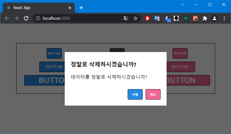
CSS in JS 의 경우 기존 css 파일을 분리하여 작성하는 방식과 개발 흐름이 조금 다르기 때문에 처음에 조금 적응 기간이 필요 할 수도 있습니다. 그 적응 기간을 거치고 나면 정말 편하게 사용 할 수 있습니다.
'오픈소스 > 노드' 카테고리의 다른 글
| [Node] React 정리(19) - Reducer를 이용하여 API 연동 기본 (0) | 2021.10.21 |
|---|---|
| [Node] React - TodoList 만들기 (0) | 2021.10.20 |
| [Node] Immer 라이브러리를 이용하여 더 쉬운 불변성 관리 (0) | 2021.10.19 |
| [Node] React 정리(17) - Context API 를 사용한 전역 값 관리 (0) | 2021.10.19 |
| [Node] React 정리(16) - 커스텀 Hooks 만들기 (0) | 2021.10.19 |


